Which Intelligent UI Charts Are Interactive?
OpenAI’s launch describes charts within visual and interactive answers. Its separate data-analysis documentation specifically lists bar, line, pie and scatter as interactive chart formats, with other types potentially returned as static images.
Do not treat that as a native Intelligent UI component catalog. A chart generated through data analysis and a task-specific Intelligent UI answer may use different tools and controls.
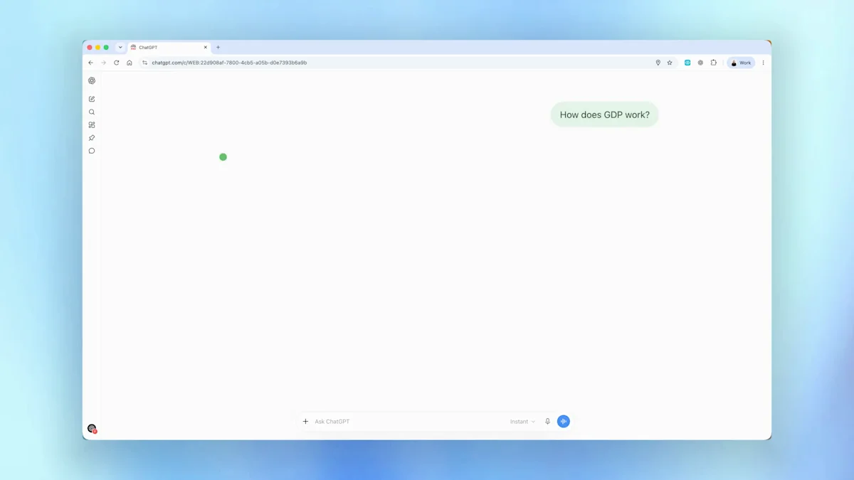
The image above is OpenAI’s official GDP explanation video poster, not proof of all ten chart formats below. Follow the source link to view the original demonstration.
Prepare the Data Before Asking for a Chart
Use clear column headers, one observation per row and consistent units. Specify what you want to compare, the date range and any grouping or calculation. A structured file or pasted table is easier to check than an image of a table.
All recipe data below is fictional and small enough to inspect. Replace it with your own data, preserving the labels and units. The prompts are suggestions from this guide, not ten tested screenshots or official prompt transcripts.
1. Bar chart
Use it to: Compare categories such as products, teams or weekdays.
Data to provide: One category label and one numeric value per row. State units and the sorting rule.
Interactive status: Named as an interactive format in OpenAI’s data-analysis documentation.
Show a labelled bar chart for fictional weekly orders: Monday 12, Tuesday 18, Wednesday 15, Thursday 21, Friday 24. Use an interactive chart if supported, include the source values and start the value axis at zero. Label the data as fictional.
2. Pie chart
Use it to: Show how a small number of categories contribute to one whole.
Data to provide: Mutually exclusive categories that form a meaningful total. Use bars instead if precise comparison matters more.
Interactive status: Named as an interactive format in OpenAI’s data-analysis documentation.
Create a pie chart for this fictional spending breakdown: food 40, transport 25, activities 20, other 15. Label each category and percentage, confirm the total and use an interactive chart if supported. Also include a table of the values.
3. Line chart
Use it to: Show change across ordered times or another continuous sequence.
Data to provide: An ordered date or time column and a value column. Make missing periods explicit.
Interactive status: Named as an interactive format in OpenAI’s data-analysis documentation.
Plot a line chart of fictional monthly signups: January 50, February 65, March 60, April 80. Keep months in calendar order, label the value axis as signups and use an interactive chart if supported. Include the exact values and note that four months is a limited series.
4. Scatter plot
Use it to: Explore a relationship between two numeric variables.
Data to provide: Paired x and y measurements, with units and an identifier for each observation where useful.
Interactive status: Named as an interactive format in OpenAI’s data-analysis documentation.
Create a scatter plot from fictional study hours and quiz scores: (1,45), (2,55), (3,58), (4,70), (5,72). Label both axes and identify each point. Use an interactive format if supported, and explain that this tiny invented dataset does not establish causation.
5. Heatmap
Use it to: Scan a matrix for concentrated or unusually low values.
Data to provide: Row labels, column labels and a numeric cell value, with a clear color scale.
Interactive status: A suggested chart recipe. Native interactivity is not established by the four-format documentation.
Make a labelled heatmap from this fictional activity matrix: Team A has Monday 4, Tuesday 6, Wednesday 3; Team B has 2, 5, 7; Team C has 6, 3, 4. Show the color scale and exact cell values. If an interactive heatmap is unavailable, return a static chart and table.
6. Candlestick chart
Use it to: Display open, high, low and close values for successive periods.
Data to provide: A date and open/high/low/close columns. Validate that each period’s high and low contain its open and close.
Interactive status: A suggested chart recipe; it may be returned as a static image.
Create an educational candlestick chart from fictional periods: Day 1 open 10 high 13 low 9 close 12; Day 2 open 12 high 14 low 11 close 11.5; Day 3 open 11.5 high 15 low 11 close 14. Label the values and explain the candle anatomy. Use a static chart if interactivity is unavailable; do not add trading advice.
7. Bubble chart
Use it to: Compare two numeric dimensions while using size for a third.
Data to provide: x, y and size columns with units. Explain how the numeric size maps to visible area.
Interactive status: A suggested chart recipe, not a confirmed native Intelligent UI component.
Create a bubble chart from fictional projects: A cost 10 duration 4 users 100; B cost 15 duration 6 users 250; C cost 8 duration 3 users 80. Put cost on x, duration on y and encode users by bubble area. Label the scale, provide the table and use a static fallback if needed.
8. Radar chart
Use it to: Inspect a small set of profiles across shared dimensions.
Data to provide: The same dimensions and comparable scales for every profile. Explain how the scores were obtained.
Interactive status: A suggested format; a grouped bar chart may be easier to compare.
Compare two fictional profiles in a radar chart using a 1-to-5 scale: A speed 4 clarity 3 flexibility 5; B speed 3 clarity 5 flexibility 2. Keep the same scale on every axis, identify the scores as illustrative and include a grouped bar alternative if radar is unavailable or hard to read.
9. Treemap
Use it to: Show the relative size of categories within a hierarchy.
Data to provide: Parent category, child category and a nonnegative numeric value.
Interactive status: A suggested format; interactive support is not promised.
Create a treemap for a fictional inventory: Books fiction 30 and nonfiction 20; Supplies pens 15 and notebooks 35. Group by parent category and size areas by count. Add labels and a table so the values remain readable; use a static visualization if required.
10. Area chart
Use it to: Show magnitude across time, or contributions over time with stacked areas.
Data to provide: Ordered time values and comparable series. For stacked charts, make sure adding the series is meaningful.
Interactive status: A suggested format that may be static. It is not one of the four documented interactive analysis formats.
Show a stacked area chart for fictional monthly orders: January A 10 B 5; February A 12 B 8; March A 15 B 6. Keep months in order, label categories and totals, and include the underlying values. Use a static fallback if needed and explain what the stacking represents.
Verify Values, Labels and the Chart’s Message
- Check the plotted values against the source table.
- Confirm axis labels, units, date order and missing-data handling.
- Check whether a color or size scale could obscure the comparison.
- Try the controls if the chart is interactive; retain a text or table explanation for readers who cannot use them.
If ChatGPT used Python for analysis, ask to review the code and assumptions. If a visual does not match the question, a different chart can help more than extra decoration.
Frequently asked questions
Which ChatGPT chart types are documented as interactive?
OpenAI’s data-analysis help page names bar, line, pie and scatter charts as supported interactive formats. Other chart types may be returned as static images.
Are all ten chart recipes Intelligent UI widgets?
No. These are chart requests to try in ChatGPT. The data-analysis chart documentation and the GPT-6 Intelligent UI feature are related user experiences, but they are not a guarantee of ten native widget types.
Why did ChatGPT return a static chart?
The requested format, task and available tools affect the output. OpenAI documents static output for some chart types. Ask for supported interactivity or choose a static chart with a readable source table.
Can I make charts from a CSV?
ChatGPT can analyze structured uploaded files when the relevant tools are available. Use clear column names and one record per row, then specify the comparison, units and chart type.
Official sources
Keep exploring
- Explore Intelligent UI features
- Use charts and diagrams for education
- Explore calculator scenarios
- Troubleshoot failed visuals
- See official visual examples